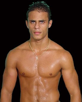
Draft Design:
 Feedback: Too much! Too loud! Too 70s! Too camp! Tries too hard!
Huh.
-----
Wider Brief: Find pictures of healthy looking, muscular men, but not overdeveloped competition bodybuilders. They should look as though they're attraction is aimed at women in a butch, masculine, tough-but-not-threatening kind of way, while in reality being deniably aimed largely at men. Somehow.
Example 1:
 Feedback: Too pretty! Too gay! Too nice! Too porny! Too ambigious!
Example 2:
 Feedback: Too geeky! Too old! Too straight! Too...just wrong!
Huh.

No comments:
Post a Comment